Redesigning a logo can be a big deal because logos are integral to brand identity for many businesses.Several popular brands redesigned their logos in 2019, with mixed reactions. Facebook’s, for example, sparked controversy and debate, while others, such as Slack’s, went over pretty well. Portfolio website Visual Objects offers an overview of five key logo redesigns.
Facebook’s new logo got a big ‘thumbs down’
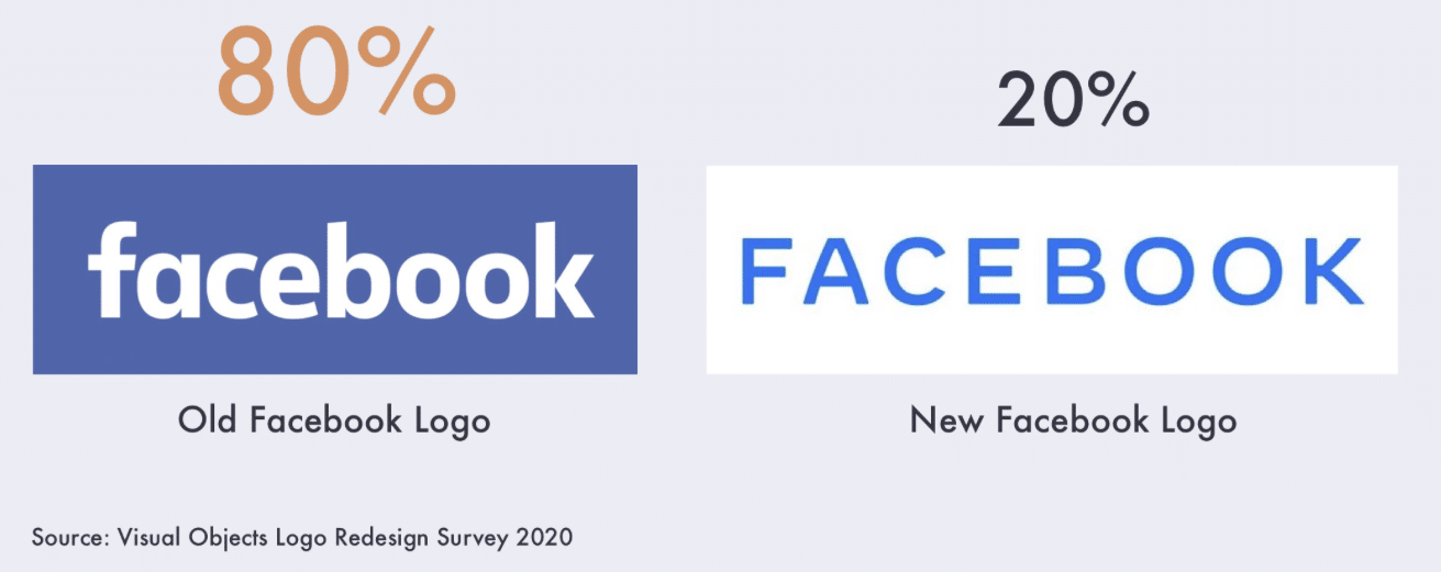
Facebook launched its new logo in November to make the platform cohesive with Instagram and WhatsApp, its other brands. Just 20 prefer of consumers, however, prefer the redesigned logo—they want Facebook’s old standard blue logo back.
The new logo features the word “Facebook” in all capital letters and alternates between its standard blue, Instagram’s purple, red, and orange, and WhatsApp’s green.
“It makes branding consistency difficult and can lead to confusion about the correct way to present the logo in different contexts,” said Dawson Whitfield, founder of logo design software company Looka, in a news release.
People prefer Slack’s new logo
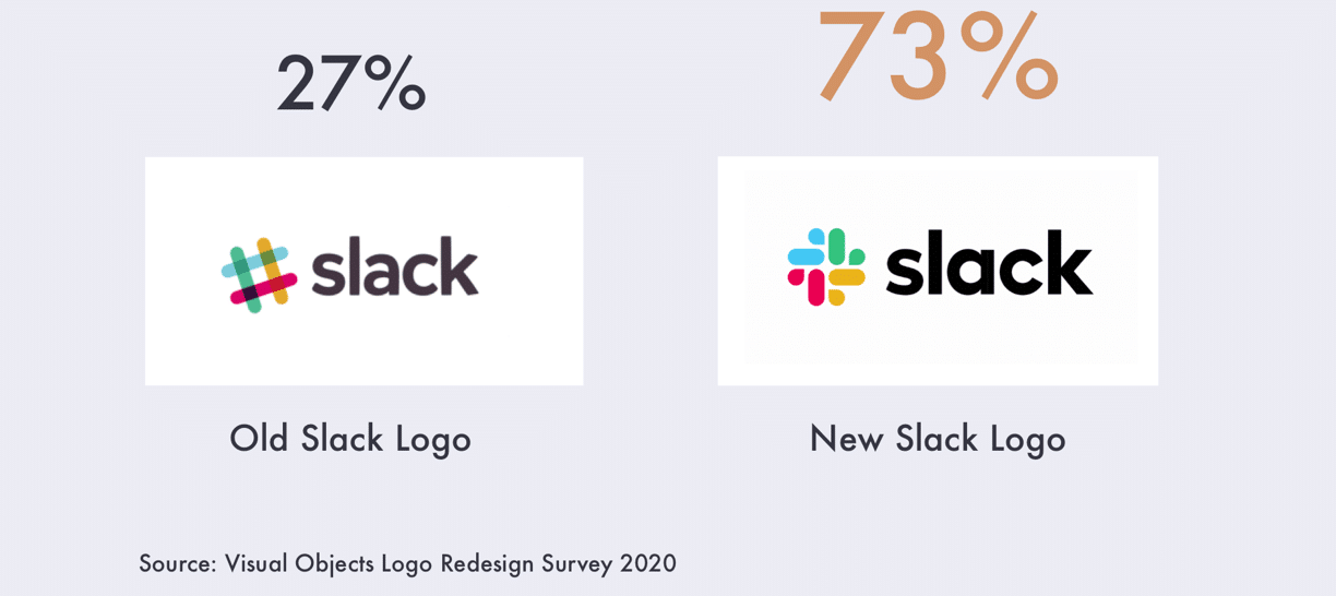
Not every 2019 logo redesign was met with negativity: 73 percent of people like Slack’s new logo. The new, non-hashtag design features a simpler but similar color palette with four quadrants of color. The new logo is also consistent across all of Slack’s products; Slack used to have different logos for its app and website nameplate, for example.
Consumers agreed with Slack that its old logo was “simply awful.”
People are split on Yahoo’s new logo
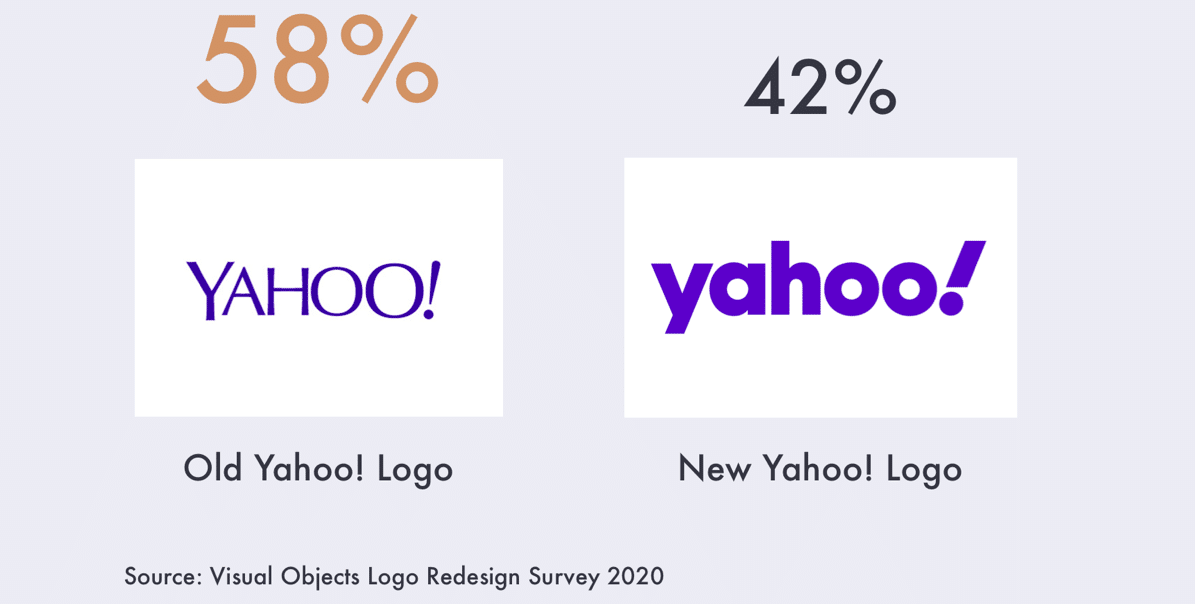
Yahoo has had six different logos since 1996, but consumers are split on its 2019 logo redesign: 58 percent of people prefer Yahoo’s old logo.
Yahoo kept its logo the same purple color, but its font is lowercase and much denser than before. Consumers are likely indifferent about the minor change, as they have seen several different Yahoo logos.
Despite Yahoo’s changing logos every couple of years, consumers are 50/50 on its newest one.
People prefer Lord & Taylor’s new logo
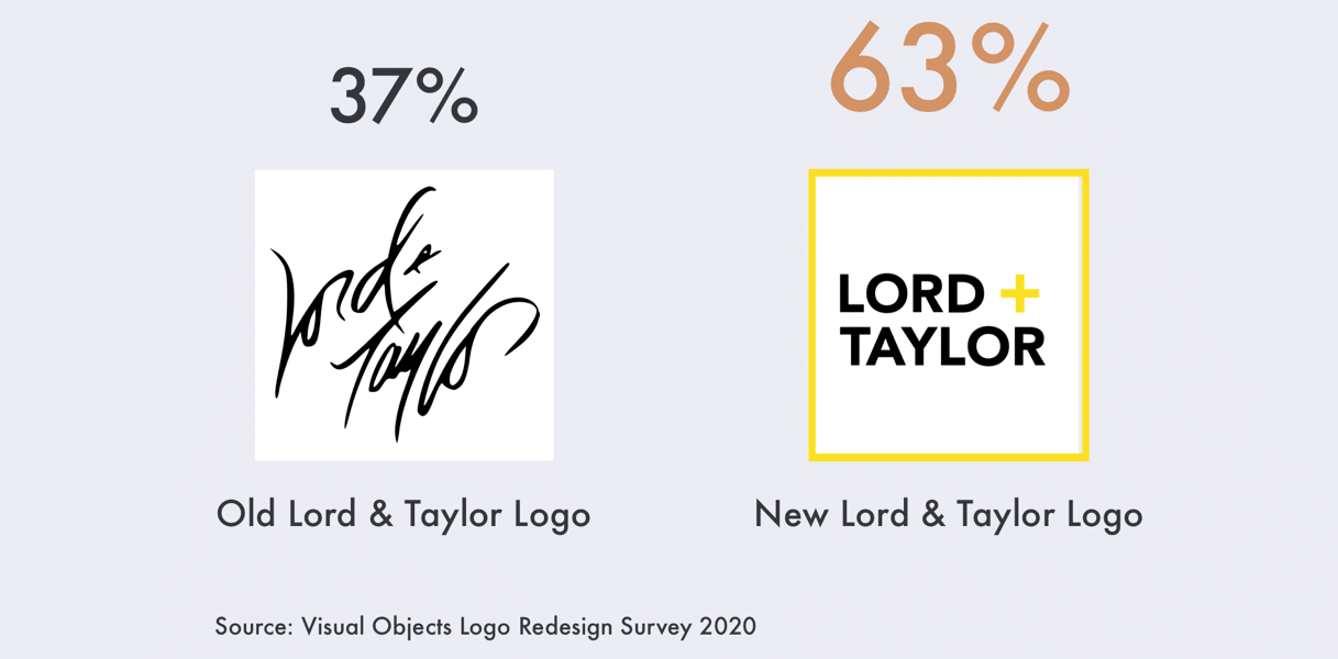
Lord & Taylor is the oldest department store in the U.S., but consumers don’t mind the loss of its old logo. Nearly two-thirds of people (63 percent) prefer the retailer’s redesigned logo.
Lord and Taylor’s new logo is modernized, with simple lettering instead of its well-known calligraphy.
“Longtime brands such as Lord & Taylor have had to consider just how hard their cursive or ’calligraphy’ logos can be for users to read on constrained mobile app screens and other online and digital marketing platforms,” said Baron Hanson, owner and lead consultant at RedBaronUSA, in the release.
People dislike the new Sears logo
Sears experienced its fair share of trouble last year. After closing 175 stores, it redesigned its logo to bring life back to the struggling brand.
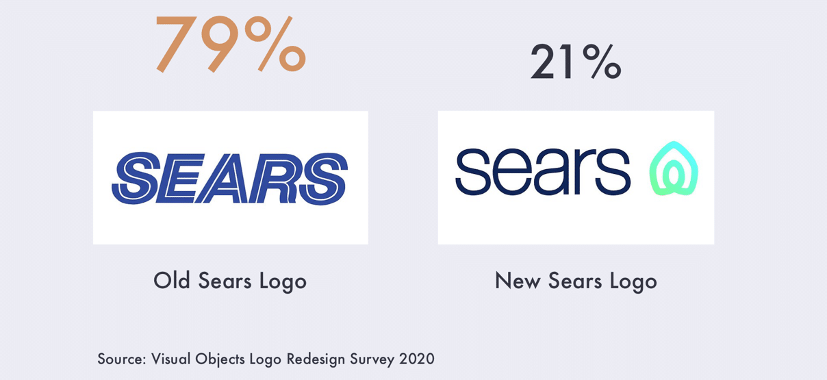
About 79 percent of people prefer the old Sears logo to the redesigned one, though. Like Lord & Taylor, Sears tried to modernize its logo with all-lowercase font, though the design has come under fire for resembling Airbnb’s.
See more logo revisions in the full report here.
Visual Objects surveyed 1,001 consumers across the U.S. to find out their opinions on major logo 2019 redesigns.


