A bad website design can have a huge impact on your sales numbers. In fact, 57 percent of consumers say they won’t recommend a website if it’s poorly designed (WebsiteBuilder). This means it’s worth considering whether some simple design tweaks could make your website more appealing to visitors—it could even end up increasing your sales.
In this article, we’re going to outline some different web design mistakes that could be affecting your conversion rate, so you can avoid them going forward. Let’s get started.
It’s unclear how to hire or buy from you
If someone wants to invest in your products or services but it’s unclear how they can do so, they aren’t going to spend too long trying to figure it out. Rather, they’ll bounce to the next site that offers them exactly what they need. This means that you need to put a lot of effort into making it as easy as possible for people to convert on your website.
There are a lot of great ways you can do this. For instance, you can use strong and clear calls to action (CTAs) that tell the reader exactly what they need to do next. You could also provide a sophisticated search tool that takes them straight to the products or services they need or provide them with a contact form where they can get in touch with you.
Let’s take a look at a few examples of businesses that make it easy to buy from them as inspiration.
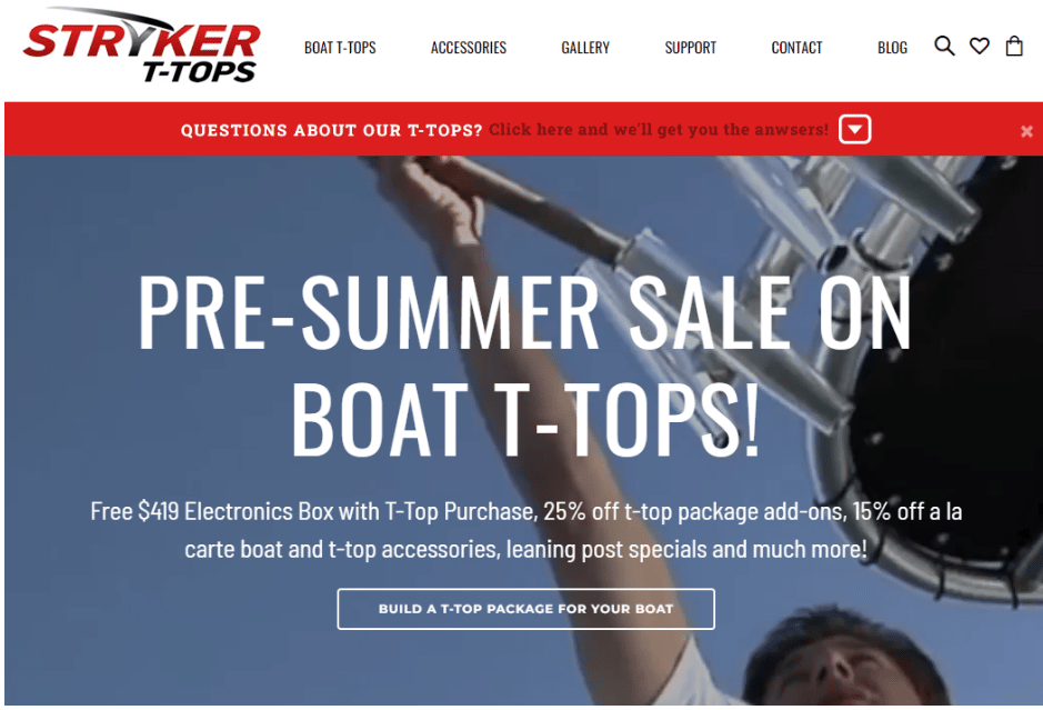
On the Stryker T Tops website, the first call to action is immediately seen above the fold. There’s a clear header that states that a pre-summer sale is happening at the moment and that those that act now will get free items, discounts, various specials, and much more.
In and of itself, this is already a very compelling reason for someone to take action. Then, the call to action is shown, which is “Build a T-Top Package for Your Boat”. The personalization on the button, combined with a well-designed and clear website makes it easy for someone to take action and purchase from Stryker.
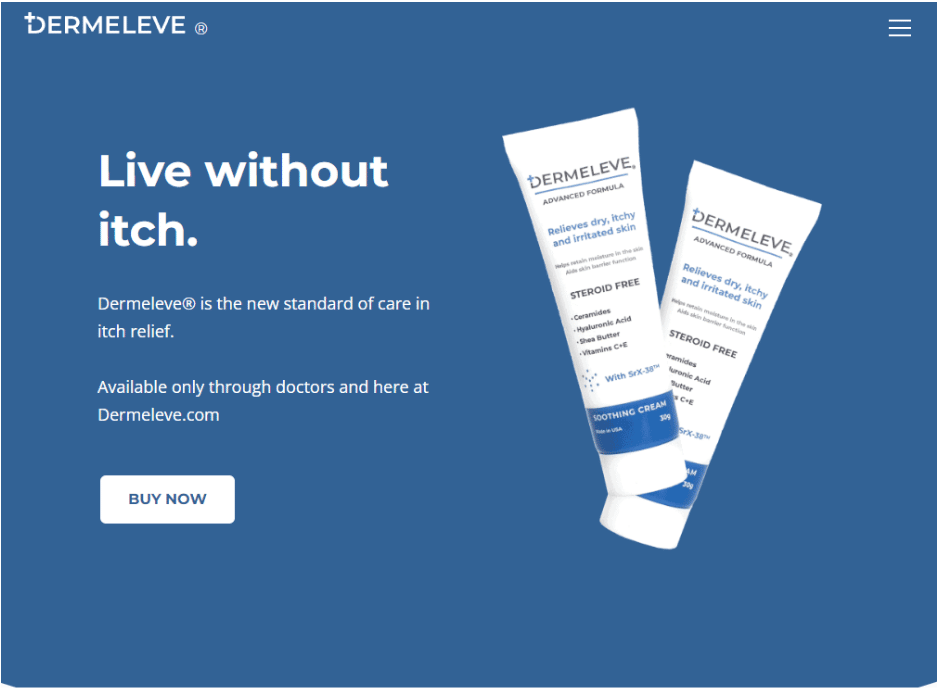
Another example of a clear way to buy is from the company Dermeleve. Providing creams that can help with itch relief, this company uses a very simple design that makes it easy to purchase from them. A visitor can see straight away what the product is, what it does, and how to buy it.
The combination of the colors used also brings out the ‘buy now’ call to action, which is also above the fold. These factors all make it easy for someone to take action and purchase the product, without feeling overwhelmed by too much information.
If you have tools that take people to the products, services, or information they need, be sure that they’re very simple to use and make it clear what’s going to happen next. This will increase the chances of people actually using these tools and finding the products or services they’re interested in paying for.
Your web pages aren’t simple enough
A messy web design can confuse people and cause them to leave your website without making a purchase. Furthermore, it can prevent them from finding the most important information that might just be the key to convincing them to spend money with you. This means that, in order to achieve your goals, you need to stick to the essentials.
Here are a few examples of elements that you definitely need to have on your website:
- A clear, easy-to-use navigation bar
- Images of your products or services
- Details of how your products or services work
- Your contact information
From there, try to keep things simple—you don’t want to overwhelm your website visitors.
Sometimes, a website redesign is necessary to achieve your goals. For example, if your navigation bar is unclear or your images are too small, it might be time for an update. However, you should only make changes if they’re going to simplify your web design and improve the user experience.
Also, keep in mind that a website redesign without losing SEO traffic or rankings requires a good plan of action. Therefore, if you don’t have much experience with website design, it might be a good idea to hire a professional.
You don’t lead with the most important information
Consumers don’t like to work hard to find the information they’re looking for. This means, when designing your website, you should always aim to place the most important details at the top of each webpage.
You should prioritize information like:
- What exactly your products and services provide for your customers
- Your unique selling points, or what sets you out from the competition
- How people can hire your business or buy from you
- Your contact information
Be sure that this information is above the fold so visitors don’t have to scroll to see it. This will ensure that the most important information is read by your website visitors and they’ll be more likely to feel confident enough to make a purchase.
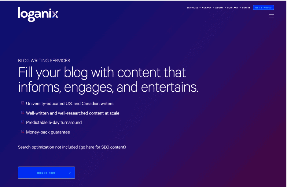
At Loganix, we work hard to ensure that we lead with the most important information when designing a new web page. For instance, on our blog writing services page, we outline some of the most important information in a few bullets. We state that we offer well-researched content with a five-day turnaround, offer a money-back guarantee, and use university-educated writers. People who come to this page will immediately be informed that our writing is of a high quality and be able to determine whether or not the service is for them.
Take inspiration from our website and keep your most important information above the fold so people don’t have to scroll in order to determine whether your products or services could help them. Ensuring your website visitors quickly find the information they need will keep them engaged and increase the chances of them sticking around long enough to make a purchase.
You haven’t used attention-grabbing website imagery
When browsing online, our attention spans tend to be very short. This means that you need to do everything you can to keep people’s attention when they land on your website. One great way to do this is with engaging and attention-grabbing imagery.
This can include:
- Photos of your staff
- Graphics that outline how your products or services work
- Impressive product photos
- Videos of your products in action
To provide you with some inspiration, let’s take a look at a business that already does a great job of engaging website visitors with effective imagery.
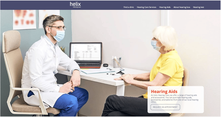
Helix Hearing Care, a hearing aid provider, has valuable and attention-grabbing imagery on their hearing aids page.
As you can see above, the company uses an image of a doctor and an elderly woman during an office visit. This type of imagery will encourage website visitors to imagine themselves working with Helix Hearing Care. They have great, helpful, and caring providers who work with all sorts of different people to help them hear and feel better. This type of imagery can therefore help to convince people to make a purchase.
Be sure to display images of people who represent your customers on your website. This will help ensure that they feel seen and recognize that your company aims to serve people just like them.
You haven’t used customer reviews to prove your value
Social proof can be extremely helpful for boosting your sales! It will help you build trust with your website visitors and encourage them to make a purchase. Star ratings, written testimonials, and video reviews are all very valuable. When people coming to your website see that many people with needs similar to their own have used and enjoyed your products and services, they’ll be more likely to make a purchase.
To gather reviews, you just need to reach out to your past customers. Consider sending them a post-purchase email that asks them to leave a review, perhaps in exchange for a discount. Then, you’ll want to post these reviews on your homepage and on the most relevant product and service pages.
Let’s take a look at a business that uses customer reviews well for inspiration.
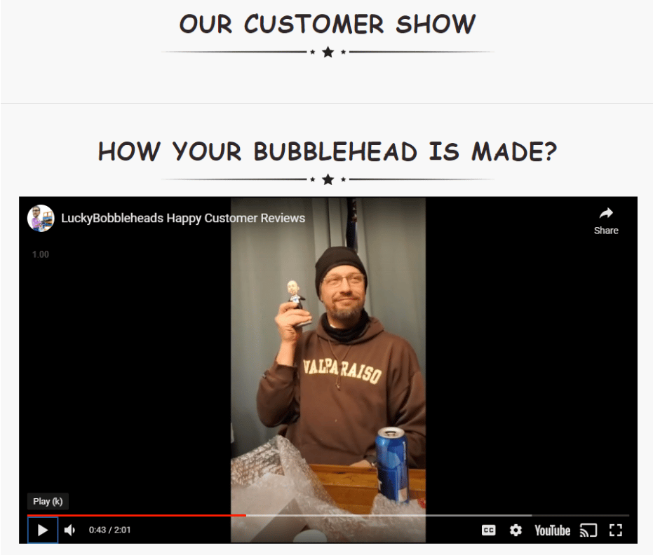
LuckyBobbleHeads.com create custom bobbleheads. Instead of a more traditional section where they list customer reviews, they have a video that combines happy customers with product shots as they open up their presents.
This is an extremely creative way to show off customer reviews and it really helps to build trust with website visitors. It also shows genuine excitement, which is always a plus!
Be sure to leverage the power of reviews on your website! These can work as social proof in order to convince people to make a purchase. You can use star reviews, video testimonials, or both — just be sure that the reviews you highlight are positive!
Summary
Getting your web design right is one of the most important aspects of running an eCommerce business. In this article, we outlined different web design mistakes that could be negatively impacting your conversion rate.
So, think about how you can improve your web design and make sure you’re avoiding all the common mistakes we’ve talked about. I’m sure there’s work to be done!

