For many business owners, the idea of an aesthetically stunning, highly functional website falls into the category of nice-to-haves in their digital marketing strategies. And considering the cost of building a first-rate website, this is understandable.
But truthfully, not investing in your business site is a huge mistake that could prevent your brand from reaching its full potential.
Well-planned web design is crucial for managing your brand’s online reputation, ensuring that your target audience perceives your business as a credible and competent entity that will prioritize solving their pain points. Your brand’s site is also the key to making the most of every customer interaction, helping you transform mere touches into conversion opportunities.
So, it doesn’t matter whether you’re trying to build a site from scratch or want to improve upon your existing online presentation. You must leave behind some of the widespread website design myths and focus on doing things right.

Source: depositphotos.com
Without further ado, here’s a quick guide on what not to do with your website in 2024 and a few proven design strategies you can implement instead.
#1 Functionality is more important than aesthetics
Consumer behavior research shows that people want to interact with websites that offer a seamless browsing experience.
Google has proven that people don’t tolerate slow sites. Adobe found that responsiveness hugely impacts people’s willingness to interact with a website. And 60 percent of ecommerce buyers abandon their carts due to poor UX design, making brands lose billions annually.
Nonetheless, while these statistics demonstrate that investing in user experience pays off, they don’t mean that you only need to focus on creating a functional site without paying attention to visual appeal.
Creating an aesthetically stunning website (that also performs seamlessly) could be the factor that sets you apart from your competitors. So, don’t hesitate to invest in a visually pleasing online presentation for your business. And understand that both B2C and B2B consumers appreciate beautiful design. Additionally, paying attention to deck design for presentations and pitches can further enhance your brand’s appeal and leave a lasting impression on potential clients or partners.
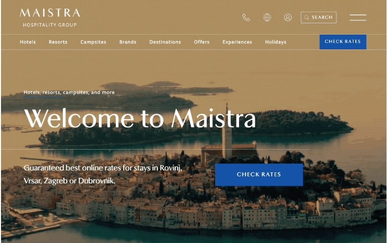
Now, if you’ve got the resources (and the visual direction aligns with your brand’s personality), you can go in a visual direction that relies on stunning your target audience. Brands mainly do this in competitive industries like tourism, trying their best to use aesthetic appeal to convert more visitors. Just check out the Maistra homepage for an example of a beautiful site made for customer acquisition.
Source: maistra.com
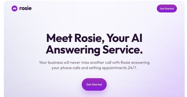
However, don’t forget that more technical industries—like SaaS—can also benefit from investing in beautiful web design. So, explore ways to create an attractive browsing experience by utilizing colors, visuals, and negative space, taking inspiration from brands like Rosie that have hit the nail on the head.
Source: heyrosie.com
#2 Stock photography is just fine
Creating a beautiful website is crucial for delighting web visitors. Nonetheless, understand that not all visuals are created equal. Some types of imagery may even harm your ability to connect with (and convert) customers.
One of the most common website design myths is that stock photography does a sufficiently good job of appealing to online buyers. And, sure, you can purchase stunning stock photos. If you’re lucky, you may even find ones relevant to your brand’s expertise.
However, if you want to humanize your brand by making it feel genuine and relatable, opt for authentic visuals—even when they’re more down-to-earth than their stock photo counterparts.
For example, check out the Classical Guitar Shed homepage. You’ll notice that the header section features an image of the brand’s owner. Why? Because the brand knows that its target audience wants a trustworthy educational service and not empty promises of stardom. So, Classical Guitar Shed forgoes the typical celebrity guitarist photos and focuses on wowing prospects through authenticity and expertise instead of using cheap marketing tricks.

Source: classicalguitarshed.com
#3 Your site’s hero section is the best place to sell your solutions
Another mistake you must avoid in 2024 and beyond is thinking that the only place for you to communicate your value proposition is the topmost section of your site.
This website design myth is complicated because it’s rooted in data. According to research, web users spend most of their web browsing time looking at the first two screenfuls of a site.
Nevertheless, while communicating the primary benefits of your solution in the hero section is essential, you must take advantage of opportunities to continually remind your audience of what your product/service could do for them.
In some ways, the best way to create a user-friendly and conversion-inspiring site is to guide your web visitors through a well-thought-out browsing journey and employ multiple opportunities to show the value they can receive by converting.
One of the best examples of this website design strategy comes from Ovaeda. Instead of bombarding prospects with product features to inspire conversions quickly, the brand takes its time communicating the user benefits prospects can unlock by converting. These include customer experience factors like free shipping and low maintenance. They involve opportunities to get free samples, which is crucial for people torn between multiple solutions. They even include offers for garden design services, knowing that some consumers prefer to leave things to the experts and would rather pay extra for help than go through the steep learning curve of a new DIY shed project.

Source: ovaeda.com
#4 Building brand trust is just about ratings and reviews
Converting customers for your business hugely relies on earning your prospects’ trust first. And beautiful design can help with the process.
However, one of the biggest myths about website design is that all you have to do to position your business as trustworthy is show off a few ratings or reviews and your audience will miraculously have complete confidence in your brand. Unfortunately, that’s not how things work in the real world.
In the era of almost unlimited consumer choice (and financial instability), consumers want genuine proof of your brand’s competence and willingness to prioritize customer needs. That’s why you need to employ more advanced trust-building web design elements to boost conversions and establish a positive business reputation.
The good news is that you can utilize almost any format of social proof or trust element as long as it’s relevant to your target audience.
To see a great example, check out the DialMyCalls homepage. This company includes six sections dedicated to establishing its credibility and removing conversion obstacles. These include:
- Reminders that free trial users aren’t obliged to subscribe to the service.
- Stats and numbers that prove the brand’s credibility and competence.
- Customer logos of some of the brand’s most famous clients.
- Several positive customer testimonials.
- Ratings on trustworthy third-party review sites like Capterra and G2.
- Badges showing off awards that Dial My Calls has received for its innovative solution.

Source: dialmycalls.com
#5 Web visitors don’t need help finding the right solution for their needs
Hitting the right balance between offering web visitors assistance and leaving them to browse your offer can be challenging. Especially if you know buyers aren’t always sure what they want.
While some data shows that 95 percent of shoppers want to be left alone while buying, other research reveals that 83 percent of people need assistance choosing products—especially technical ones.
With this in mind, one of the website design myths you must leave behind is thinking that one type of sales approach fits all prospects. That couldn’t be further from the truth. After all, most web visitors don’t populate the same stages of the sales funnel. That means they’ll require different resources to make buying decisions.
So, instead of forcing a specific shopping experience on your potential customers, do your best to provide guidance. But do it on their terms.
Instead of adding an intrusive AI chat feature to your site that bombards visitors with questions, consider ways to make it more helpful to your audience. For example, the Gleap website uses a chat feature that allows web visitors to choose the type of interaction they want — regardless of whether that involves reporting an issue, requesting a feature, or asking for support.

Source: gleap.io
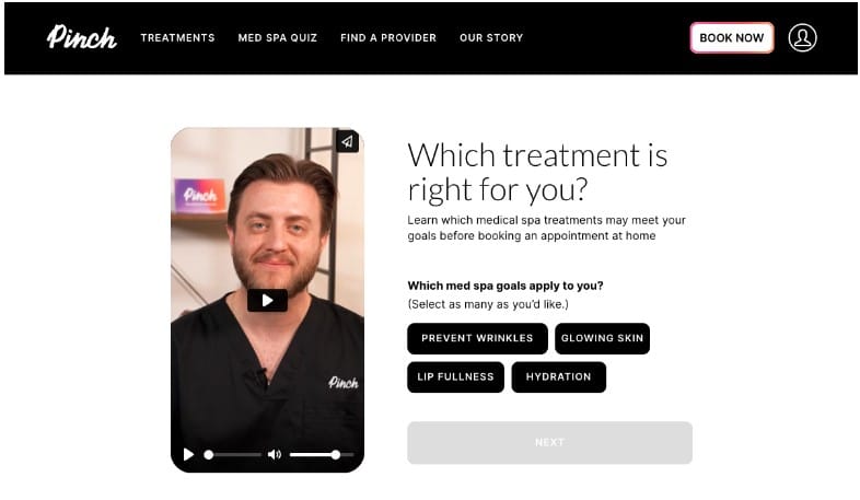
Or, if you want to make the shopping process even more user-friendly, you could take inspiration from Pinch. This brand includes an interactive Med Spa Quiz toward the bottom of the homepage, helping visitors find the ideal service by encouraging them to watch a few short videos and answer a couple of questions.
Source: bookpinch.com
Of course, providing prospects with the help they require doesn’t have to involve advanced website features. If you’re working with limited time or budget, you can still give your buyers all the help they need by creating a support page.
This is what Vinyl Status did with its Help Center. On the page, it answers a bunch of FAQs regarding the purchase process. Plus, it provides web visitors with a convenient contact option in case they need human assistance.

Source: vinylstatus.com
#6 Search is just for finding products
User experience research shows that 69 percent of online shoppers go straight to the search bar when landing on an ecommerce site.
So, if you’re running a retail business and want to present customers with an exceptional shopping experience, designing a visually stunning and functional search bar for your website is crucial.
However, to make the most of this UX feature, forget the myth that it’s just a product discovery tool. On the contrary—a powerful search function can play a role in multiple stages of the buyer’s journey. So, you must optimize yours for the best possible results.
For instance, Greenhouse Emporium is a brand that does search marvelously. The bar is positioned at the top of the homepage, where it’s guaranteed to attract web visitors’ attention. Much more importantly, entering a search term into the space brings up a variety of results, including category pages, content, and products, ensuring that the function serves users populating each phase of the sales funnel—from awareness to post-purchase.

Source: greenhouseemporium.com
#7 Lead generation happens naturally
Last but not least, if you want to do away with web design myths and take your site’s conversion rates into your own hands, remember that most purchases don’t just happen.
Instead, people go through a complex process when choosing what products to invest in. And they often need incentives and nurturing to place their trust in your brand.
With this in mind, to maximize the effectiveness of your website at acquiring customers, use your site’s design to boost your lead generation efforts. That way, you can get the most out of your website even when visitors aren’t ready to buy.
Plus, you can combine the trust-enhancing effects of beautiful website design with your social, content, and email marketing strategies to nurture potential customers into loyal clients of your business.
Of course, the most essential part of making this tactic work for your business is to ensure that your lead-capture elements are visible and attractive. Fortunately, that’s not difficult to achieve.
Just check out how Chisos does it. Knowing that online buyers love a good deal, Chisos invites first-time web visitors to subscribe to its newsletter to get a chance to win a $100 gift card.

Source: chisos.com
Wrapping up
While the website design myths covered in this article have some anchor in reality, most have been proven incorrect. So, if you want to achieve exceptional site performance, do your best to adhere to the best practices of creating a high-converting site.
Of course, remember never to follow any web design rules blindly.
Instead, to get the results you’re after, always make sure you test your design choices. Moreover, keep up with your web visitors’ behavior. That way, you won’t miss a precious opportunity to improve site performance and sales. Plus, you’ll have a much better chance of impressing first-time web visitors and encouraging them to do business with your brand.


